|
How did you happen to become a game box designer? Is your background in art? Computer graphics? Marketing? Were you a gamer before you started designing boxes? I’d just finished up at a fancy and grossly expensive art school and I was utterly cashless and badly needed a job. I would have worked just about anywhere, but luckily, my friend happened to be working in the accounting department of a certain video game company. She got me a job as an accounting clerk. As I hand-delivered paychecks every Friday, I’d pass through the graphics department where they were designing all this fun stuff: logos, boxes, posters, tradeshow signs… Mesmerized, I thought, “I’d absolutely love to work here.” I soon landed a job as a coordinator in the department I coveted. I wasn’t designing anything at first, but I got the chance to learn the programs and observe the process of game box design. From then on, I was hooked. I play newer games, but I’m an old-school gamer at heart. I still love Centipede, Ms. Pac Man, Adventure, Gauntlet, Crash Bandicoot… In fact, now that I think about it, I guess I like games where you can collect lots of stuff as you go along, which figures. So much about graphic design is about collecting ideas and things. I think it helps if you have a touch of OCD!
Could you give a brief description of the steps you go through to design a game box? Sure. 1. Pleasing groove. 2. Mild panic. 3. Crikey!! 4. Thoughtful determination. 5 . <whew> Seriously tho, designing a box is as much about communicating the right message as it is about pretty images. You have to make sure it meets the marketing and brand objectives for the product. I generally get a brief from the brand manager that describes what sets this game apart from other Myst games and from competitive products. Then I come up with ideas that are in line with the message, and we all work together to refine them into the final box.
Do you play parts of the game before designing the box? Occasionally I do get to sneak-preview the early playable versions, but I always get to see at least rough clips and sketches of the game in its early form, which is really cool.
Do developers have input into the design process? Definitely. They’ve put a lot of work into building the game and care very much how it’s represented on store shelves, so we like to collaborate. They help us choose what scenes and elements to use from the game and give input on logos and designs.
How do you pick which screenshots to use? Do you ever edit or alter any of the game images/screenshots? Are you working solely with digital images? Do you ever paint or draw anything? The brand manager Sarah Berridge and I go through all of the screenshots provided by the development team and decide which ones best show off the game. As far as touch-ups go, the printing process usually yields much darker pictures than you’d normally see on a bright computer monitor. Since all the images on the Myst boxes are digital and meant to be seen on a computer, I might brighten and adjust images so they represent the game experience and don’t come out dark and mucky.
What do you do to add texture to a game box? Well, not to sound too graphic-design-geeky, but I love embossing and special varnish treatments.
Are you involved in selecting the excerpts from previews to put on the box? How do you decide which ones to use? Not me, that’s usually Sarah’s call.
When looking at the overall design, how conscious are you of shapes and the placement of shapes? I’m always thinking about the shape of everything. I pull together logos, blocks of copy, headlines, and screenshots, and hopefully make all those parts look like they belong together.
What is the biggest constraint you face? I think the biggest challenge is always “how much copy can we squeeze onto the box?” There’s so much in the Myst world that makes it unique that we want to be sure that people who aren’t already familiar with the world of Myst can get a thorough sense of what’s inside.
Does expense factor into many of the design decisions? Sometimes. There’s a budget we have to work within, but you’ll find that with any design project.
Have you ever considered doing anything wild with the design? A triangular-shaped box? A box with a holographic image? A box with a little flashing light? A talking box? A box with a bright purple background? Well, there is that budget to consider, but for the first release of Uru, we did toy with the idea of doing a 3D lenticular cover. After looking at a few samples of other lenticulars out there, though, we came to the definite conclusion that certain gimmicks take away from the artistry of Myst. We never thought of a talking box, though…
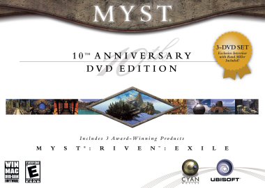
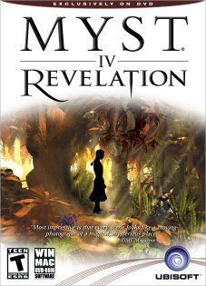
How long does it take to design a box? Do you create several trial versions? If so, who chooses the final design? It can actually take up to eight months or more for a box to gel. I’m working on other titles while we’re gradually developing a Myst package, but generally, from start to finish, it spends several months on the table. I design many different versions of the covers – I think I did up to 40 comps for the Myst 10th Anniversary box, which is a lot. For Revelation, we invited a group of fans to a focus group, and their comments helped us choose the final box front. It’s hard to see which is the best box after you’ve been around the images for so long. In the end, the fans actually confirmed my favorite idea, showing Yeesha in the shadows of the forest. (See? They should have listened to me in the first place!)
What makes a particular box stand out from all the other boxes on the shelf? Is there any research out there as to how a box can affect sales? We always look at our box next to other games of the same genre. You can tell right away if it stands out or not. We also use focus group testing to make sure our message is getting across. Bottom line: we know people will respond favorably to a nice box, but we also have something essential to communicate about the product.
In addition to the boxes for Myst IV: Revelation and Uru: Complete Chronicles, what other game boxes have you designed? Is designing a box for a Myst game different than designing for other games? I work on a very wide range of products: Winnie the Pooh’s Rumbly Tumbly Adventure, Dukes of Hazzard, Lumines, Rayman, Alexander – even the FragDolls, Ubisoft’s team of female gamers. Myst, however, is my favorite game to design for. It has an elegant, artsy look and feel.
On the Myst IV: Revelation box – what made you decide to use Yeesha’s silhouette rather than a more typical image of her? (It very effectively draws the eye by the way!) Were you trying to distinguish her from her surroundings? Was the silhouette drawn, or taken from a digital image? Were you harkening back to the silhouette from the original Myst – the falling man? My original intention was to use a photo of Yeesha, but no high-quality photos were available. The development team wanted to have a photo-shoot, but they weren’t going to be done in time for all of my fast-approaching deadlines. So I drew Yeesha’s silhouette in a critical moment of inspiration.
Also on the Revelation box – I love the font on the inside cover with the words: Betrayal, Mystery, Adventure, Truth. Did you experiment with a lot of fonts before you found it? Would you ever choose to use a font like it on the front cover? I look through dozens, sometimes hundreds of fonts until my eyeballs go dry, or I see one font that feels right. On cover of The Path of the Shell, I also used a font that is more calligraphic and funky.
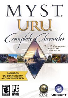
On the Uru: Complete Chronicles box – what gave you the idea for the unusual diamond and band design on the cover? There’s also a faded background image on the front cover. It’s subtle, and I’m not sure that everyone is going to notice it consciously. Is it there to give the artwork another dimension? It started with Myst 10th Anniversary. We wanted the box to feel clean, special and uniquely elegant. Sarah had the idea of having a “filmstrip feel” on the box, and I wanted a piece that kind of resembled a piece of jewelry. I thought the diamond/screenshot band was a perfect mesh of both ideas. The faded mushrooms on the front of Complete Chronicles are there for texture. They also hark back to the original Uru box, where they appeared on the inside flap.
On the inside cover, I like the little white translucent boxes with text in them – great effect. Was this your own innovation? Overall, do you consider the Uru box design to be more experimental than the Revelation box design? Hey thanks! Again, it was “form follows function.” I was told, “We need to fit this copy on there!” I thought the semi-translucent boxes would at least let you see some of the image behind them. Yeah, I guess I’d agree that the Uru box was more experimental, because we had to find a way to neatly convey three products on one box.
Also on the Uru box – this is a Myst fan-type question – the back of the box shows the front cover of the game box for Myst Uru: To D’ni. As far as I know, To D’ni was sold as a download alone. Was the To D’ni box ever actually produced? Nope. It was a special box front made just for the download.
|